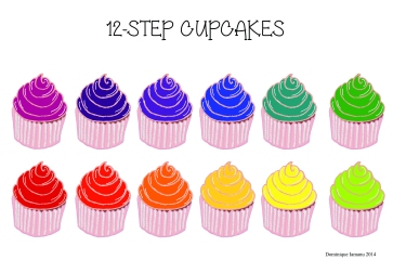
Color has a profound effect on the human experience and psyche. Every person has their own personal associations with color and each culture, family, society, and religion have their own unique ways of perceiving and reacting to individual colors. Use of color has psychological effects and is associated with medicine as well. Today I will take a look at how American culture views each of the seven main colors of red, orange, yellow, green, blue, purple, black and white.
Red
Red is one of the most powerful colors of the spectrum. The color red is associated with all types of emotions, both high and low. For example, red is coupled with love and passion as well as violence and fire. Red is known to have a stimulating effect on energy levels in humans. It is an incredibly visible color and is often used for cautionary purposes, such as red stop signs or red fire hydrants. Both the human eye and human brain strongly perceive and react to red.

Yellow
Another warm, infusing color is yellow. While most people associate yellow with being a bright and cheery hue, it also has the potential to appear cautious. Street signs, caution tape, and other warnings are often in yellow to attract our attention before we could get hurt. In nature, many toxic plants and animals, such as snakes and frogs, have yellow accents to ward off potential predators.
 |
||
Orange
Orange is produced by mixing the primary colors of red and yellow, and is thus a secondary color. The joys of yellow and the striking visibility of red combine to produce the energetic color orange. Orange is stimulating and warm. Orange is a good color to use to draw attention to something without appearing as harsh as red or as bright as yellow.
Green
Green is a secondary color as it is created by combining two primary colors, blue and yellow. Green is a prevalent hue, as it is one of the most dominant colors found in nature. Almost every climate across the globe has naturally green flora and fauna. Because it is so widely recognized as a naturally occurring element, the color green is associated with growth and wealth.
 |
Blue
Another color dominant in nature is blue. Blue represents both water and sky and is associated with stability and tranquility. The calming effects of blue are so well known that many logos of Corporate America utilize this hue. Corporations use the color to appear more calm and trustworthy to clients and potential customers.
Purple
Purple, like orange and green, is a combination of two primary colors and is therefore a secondary color. Because it is usually created with a 50/50 ratio, purple also bears the characteristics of both colors of which it is made. It maintains an energetic, powerful feel from its red component; likewise, the stability and depth of blue influences how purple is perceived.
Purple is different from other colors in the fact that it is not common in Nature. Granted, some flowers and plants have purple tints, but they are few in number. Because it is a rare pigment to find naturally, purple used to be a rather expensive color to obtain; it was often reserved for noble, royal individuals who could afford such an expense. To this day, purple is associated with kings and queens as well as magic and mystery.
White
The color white is typically associated with luminous, pure items. Angels are historically depicted in white, as are many other Heavenly bodies and settings. Based on its purity, white is also associated with cleanliness. Pure white soap is considered the Gold Standard in cleanliness; all absence of every other color is the highest level of clean one could obtain.
 |
Black
Considered to be mysterious, black is a very complex color. It can convey sorrow and angst, as seen in the trend of black for funerals and death. Black also may appear luxurious and trendy, such as a black stretch limo or a black tie affair. As is the case with most colors, black needs to be considered on an individual basis based on its surroundings and connotation.

And there you have some examples of how color affects the psyche. |


