20th century

The International Style: Integral to the history of typography

A major force in the history of Typography is arguably The International Style, also known as the Swiss Style. This is the style that is most firmly planted in my mind as being a 20th century methodology that has shaped modern typography. Though decades have passed since this style rose in popularity, it is still a methodology of sorts that is still used today.

The International Style came about in 1950’s Switzerland where the hallmarks of modern style began. It is characterized by the use of flush left sans-serif fonts and the use of a grid to create clean, readable and objective design concepts. International Style relies on strong and vibrant color, geometrical forms and effective photographic images as elements. Layouts are based on a mathematical grid and elements are planned out in accordance to this structure. The grid system and strong typographical statements gives the Swiss/International style that certain look and feel. From the 1550’s to 1960’s this style dominated the commercial design scene.

ITS had its origins in the 1920s and 1930s when designers were developing new ideas to coincide with industrialization and technological advances. Printing technology was advancing and growing and a clean readable font was required. The sans-serif font of the Swiss style was an answer for that. Jan Tschicholds 1928 book Die Neue Typographie was a major influence of Swiss style designers as well. This style was not only a response to new technologies but also also an outlook by designers who saw there work as useful and as elements of social change.

The Swiss style is still important today, especially in the arena of corporate design. The focus on legibility and cleanliness are still important facets of logo design, government and corporate. The simple and flat designs of the time period which sought to remove excessive ornamentation was criticized as being cold and formulaic, but Swiss Design has an important place in the 20th century and today. The idea that designers are not only artists but should also be aware of there social responsibility, and also problem solvers trying to fix problems associated with technology, accessibility and readability, are just as relevant today.

The International Style was an important style in terms of its place in typographical design history and its influence today. The method in which designers such as Joseph Muller-Brockmann and Max Bill chose to tackle design problems is the basis for modern Graphic Design theory. The Swiss Style was created in an era of scientific advances, social strife and war. Today is an era of scientific advances, social strife and war. The lessons learned from ITS are no less relevant in the world of mobile devices, web accessibility and marketing.

Designer of the week: Edward Benguiat

Benguiat

Benguiat Portrait

Typographer Biography: Edward Benguiat

Edward Benguiat, born on October 27, 1927, is a designer who has created many well known typographical designs. Born in Brooklyn, New York, his father worked at Bloomingdale’s as a display director and at the age of 9, began to learn the tools of the trade from his father. Before WWII, he began an interest in music and percussion will led to a love of Jazz. He enlisted in the Army during WWII and afterwords started his music career and gained popularity as a Progressive Jazz Musician. Edward later would say how graphic design and typography is comparable to the rhythm of music composition (Halperin, 2000). With his strong music background, he then used his GI Bill and enrolled into the Workshop School of Advertising Art. He became Paul Standards’ understudy. Edward would go on to have a successful career as a Designer and Art Director. He partnered with Ed Ronthaler and created Photo-lettering Inc.

Career Highlights

In 1953 he was an associate director of Esquire magazine. In 1962 he would go on to start is own New York design studio. Edward has been very influential in the typography world. He helped establish the international type face association, the first independent licensing company for type designers which aimed to market type design to the industry. This led to a growth in the type industry in the 1960’s. His first ITC Project was Souvenir. Condensed, and many more. Ed continues to create typefaces for ITC, including the recent Edwardian.

Ed created or re-designed many well known logos including Esquire, Mcalls, The New York Times, and The San Diego Tribune, among many others. He is still very active and design, and having been a prolific designer since the 1960’s he has seen the change and growth in the design industry. He has said that “Too many people think that they’ve got a Mac and they can draw a logo or a typeface. You have to learn to draw first. The computer won’t do it for you” (Halperin, 2000)

Edward received the Gold Medal of excellence from the New York Type Directors Club as well as the Frederick W. Goudy award. He currently does lectures around the world and since 1962, has been an instructor at The School of Visual Arts.

Typography

Edward is credited with the creation of over 600 typefaces (Strizver, 2006) He created the typefaces Tiffany, Benguiat, Benguiat Gothic, Korinna, Panache, Modern No. 216, Bookman, Caslon No. 225, Barcelona, and Avante Garde. ITC Souvenir is based on Souvenir by Morris Fuller Fenton which was originally a single weight typeface, Ed added additional weights and italics . It was redrawn by Benguiat in 1967 for the Photo-lettering Corporation. ITC Benguiat is a decorative serif typeface released in 1978 and is based the typefaces of the Art Nouveau period. He continues to work on typefaces for ITC and his more recent font is Edwardian Script.

 scriptpage

References

Strizver, I. (2006). Type rules!: The designer’s guide to professional typography (2nd ed.). Hoboken, N.J.: Wiley.

Font Designer – Edward Benguiat. (n.d.). Retrieved January 24, 2015, from http://www.linotype.com/1515/edwardbenguiat.html

Halperin, E. (2000, January 1). Edward Benguiat. Retrieved January 24, 2015, from http://adcglobal.org/hall-of-fame/edward-benguiat/

ITC Benguiat. (2015, January 1). Retrieved January 24, 2015, from http://en.wikipedia.org/wiki/ITC_Benguiat

Souvenir (typeface). (n.d.). Retrieved January 24, 2015, from http://en.wikipedia.org/wiki/Souvenir_(typeface)

Ed Benguiat. (n.d.). Retrieved January 24, 2015, from http://en.wikipedia.org/wiki/Ed_Benguiat

\

Graphic Designers of the 1950’s to 1970’s

Paul Rand
Well known for his timeless and iconic logos. His work illustrates how some logos can withstand the test of time. If you’d like some more insights into Rand’s thoughts on design watch this supplemental video.

Paul Rand Logos

George Lois
George Lois is the mastermind behind a number of timeless advertising campaigns, logo designs, and design concepts. Many of the pieces in this gallery contain supplemental commentary.

George Lois Ad

Herb Lubalin
Herb Lubalin puts an emphasis on concept in his logo work. In addition to his design work, Lubalin is also known for his typefaces, including Avant Garde.

Lubalin Logos

Milton Glaser
Known for the iconic  “I Love NY” logo. A celebrated designer whose work includes logos, magazines, packaging, and more.

Milton Logo

Modernism

The beginning of the twentieth century coincided with the advent and growth of  the Modern Art Aesthetic. Listed below are some of the major movements of the time period (1900’s to 1930’s) that had a major impact on the direction of design, and still influence design today.

Cubism

Cubism was one of the first influences of modernism. This was an experimental art movement that looks at layout and space in new and innovative ways. Think Geometric Abstraction. Pablo Picasso was a major artist of this style as well as Fernand Leger. His work influenced new letterform compositions. Cubism was about questioning the status-quo and encouraging new ways of looking at space.

Futurism

Like Cubism, futurism was a new direction away from old thinking on aesthetics. It was not only an artistic movement,, it was also a social movement as well. Futurism sought to embrace a new and fantastic future.  Futurism was about speed and mechanization, it embraced technology and high minded ideals. It influenced architecture, literature, film, and design as well as introducing creative type as typography took on new creative forms. An example of this new typography work can be seen in the work of Lewis Carroll, author of Alice’s Adventures in Wonderland.


Dadaism

Dadaism was a strong social stance. It was an avant-garde anti-war movement that was against the exploitation of the wage-earning class and even rejected forms of art. The work of this style challenged politics and was considered controversial for its social and political stances.

Dada pushed boundaries and was highly experimental. It was a heady influence on graphic design. The idea of photo manipulation was not necessarily new, but the Dadaists would push it in new, exciting directions such as John Heartfield’s work “Hitler Swallows gold and spouts junk”. Manipulating photos was not a new method by the time Dadaism came around but it did prove the power of photography and montages.


Surrealism

Surrealism came about at the beginning of the century and was inspired by Dada. It questioned the very nature of space and time. Some noteworthy contributors including Salvador Dali and René Magritte. Surrealist works dealt with the human psyche, dreams and human nature, often combining visual elements in unnatural ways. Frida Kahlo has often been called surrealist, in the way she combined the realistic with an otherworldly element. Surrealism as an art form is alive and well in todays art world.


Plakatstil

Plakatstil (German, “Poster Style”), was almost the antithesis to Surrealism. It embraced flat colors, minimalistic qualities and focused on layout and typography. with emphasis on the relationship between pictorial and typographic elements.  A great example of this style is Lucian Bernhards “Poster for Priester Matches”. Note the flat, solid colors, contrast, and use of negative space. Compare this to the complex and colorful Art Nouveau which preceded Plakatstil and you get a sense of the giant shift that took place in terms of art and design and the minimalism that began to dominate.


Graphic Design History: Art Nouveau – 20th century

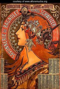
Art Nouveau (French – “New Art”) was a aesthetic of the late 18th century to the early 19th century that questioned the very nature of aesthetics. As art and design moved toward the modern era, Art Nouveau was a truly international style that maintained strong aesthetics despite of industrialization. Artists such as Alphonse Mucha and Henri de Toulouse-Lautrec are great examples.

Savonnerie De Bagnolet By Alphonse Maria Mucha

Savonnerie De Bagnolet
By Alphonse Maria Mucha

http://www.alfonsmucha.org/Savonnerie-De-Bagnolet.html

The Japanese Ukiyo-e (pictures of the floating world) design movement was a major influence on the western art world during this time period, and this was a driving influence in Art Nouveau. Ukiyo-e is expressive and organic line art which remained an important design aesthetic in Japan for centuries. Unlike the arts and craft movement, Art Nouveau was not just focused on the small time artist or craftsman. Art Nouveau also translated to everyday objects, furniture and architecture, to stained glass and well known for the poster ads of the era.

Some artists and designers of the time such as the The Glasgow Four  preferred the aesthetics of Geometry to the sometimes heavily floral embellishments of Art Nouveau. The Vienna Secession was another group that experimented with spatial relationships and layout design. This experimental era was the advent of modern design.

KUNISADA (1786-1864)  From the series "The fifty-three stations of the Tôkaidô" (with portraits of actors) - 1852  Signature: Toyokuni

KUNISADA (1786-1864)
From the series “The fifty-three stations of the Tôkaidô” (with portraits of actors) – 1852
Signature: Toyokuni

http://www.secutor.se/ukiyo-e/umaxi009.jpg
See Art Nouveau posters at http://www.internationalposter.com/style-primer/art-nouveau.aspx
Check out Japanese wood block printing at http://www.metmuseum.org/toah/hd/ukiy/hd_ukiy.htm